Against my better judgement and repeat warnings from those who knew better, I went ahead and installed Mojave on my work computer the first chance I got. Sure, there were certain standard beta bugs and capability issues that made me regret the decision on occasion, but the only way to sufficiently test a product like this is use it day to day.
I can’t claim to have used every feature with any regularity. But that’s just the nature of an operating system upgrade. There’s a lot of ground to cover, in order to assure the update covers as wide a swath of users as possible. There are international features and updates to Apple’s machine learning offering — things that, in my case, don’t really impact usage.
Even with the broad scope of updates contained herein, however, 10.14 represents what is arguably the most focused macOS release in recent memory. Unlike High Sierra, which felt, in many respects (name included), like a refinement over its predecessor, Mojave finds Apple with specific mission in mind.
The last few years have seen the company hit mounting criticism that it had taken its eye off the ball when it comes to creative professionals — a segment of users long regarded to be the spirital core of its desktop offerings. There was a backlash against Final Cut, when Apple made changes for the sake of simplifying/streamlining, removing the high level of customization videographers had come to rely on.
Last year, meanwhile, Apple presented an uncharacteristically transparent view into the trials and tribulations of the Mac Pro line. “If we’ve had a pause in upgrades and updates,” Phil Schiller said during a roundtable discussion, “we’re sorry for that — what happened with the Mac Pro — and we’re going to come out with something great to replace it.”
Companies like Microsoft have seen opportunity in Apple’s further push into populism, targeting the ever-growing Surface line at those creative Pros. After all, while the category isn’t ultimately a huge one, the videographers, artists, musicians, et al. who use the products are among the most influential when it comes to buying decisions.
But Apple has begun to address these concerns. While the Mac Pro won’t be arriving until next year, it’s made important strides on the hardware front. The iMac Pro, for instance, presents an all-in-one alternative to the modular desktop, while the latest MacBook pros offer up some downright nutty specs on the high-end.
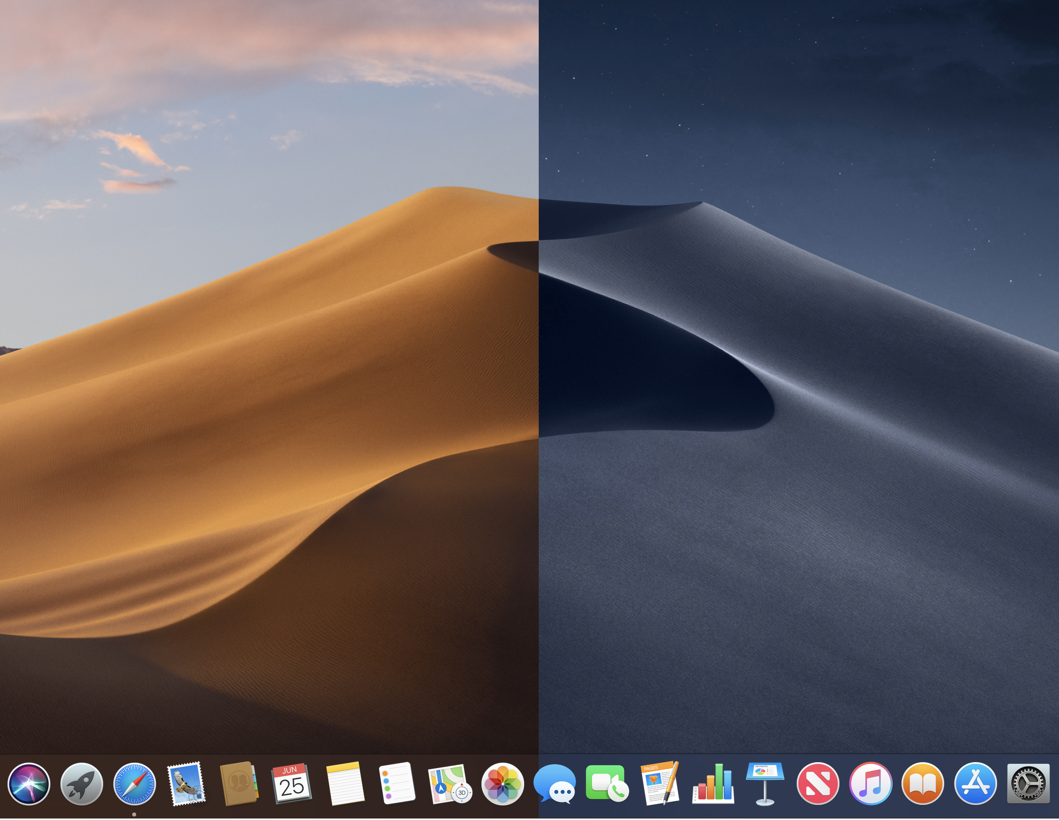
Mojave plays a central role in all of this. Many of the operating system’s marquee features cater to precisely those power users. Dark Mode, Gallery View, file metadata and Stacks are among the top new features here, and each have creative pros firmly in their sights.
I’ll be the first to admit that you’ll need to broaden your definition of “creative professional” pretty damn wide before I start to fit in. When Apple trotted out photogs, producers and interactive artists for a recent event, I’d be lying if I said I felt like I belonged.
That said, I’ve found a place for many of the aforementioned features in my own daily workflow. In the interest of giving the most time to those features I’ve spent the most time with over the course of the last four or so months, let’s start with the Mojave additions I’ve found the most useful.
Stacks
Every new version of macOS comes with several features that I can easily visualize becoming a part of my daily process. I get excited about the ways in which these additions will help me become faster, more productive, better organize. Invariably, however, they slowly fade into the background. I stop making the effort to engage and ultimately forget they’re even there.
In the case of many of them, I know my own disorganization and idiosyncratic methods are as much to blame as anything. The features are well-intentioned, but workflows are stubborn. And besides, just because you pay for the gym membership doesn’t mean you’re going to keep that New Year’s resolution, right?
Stacks, on the other hand, is straight up useful. As Apple has moved away from the desktop-based folder system, I’ve found my desktop growing more and more messy. It’s become the throw the dirty laundry anywhere approach to computer use. It’s bad and I hate myself for it, but what are you going to do?
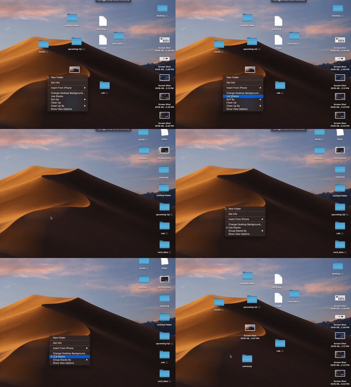
Upgrade to Mojave, for one thing. While it’s true the company’s leaning heavily on Dark Mode as the flagship feature, Stacks is quietly the best and most useful addition. If you’ve got a messy desktop, simply Control+click the wallpaper or chose Use Stacks under view in the menu bar. Choosing this will automatically sort files into piles.
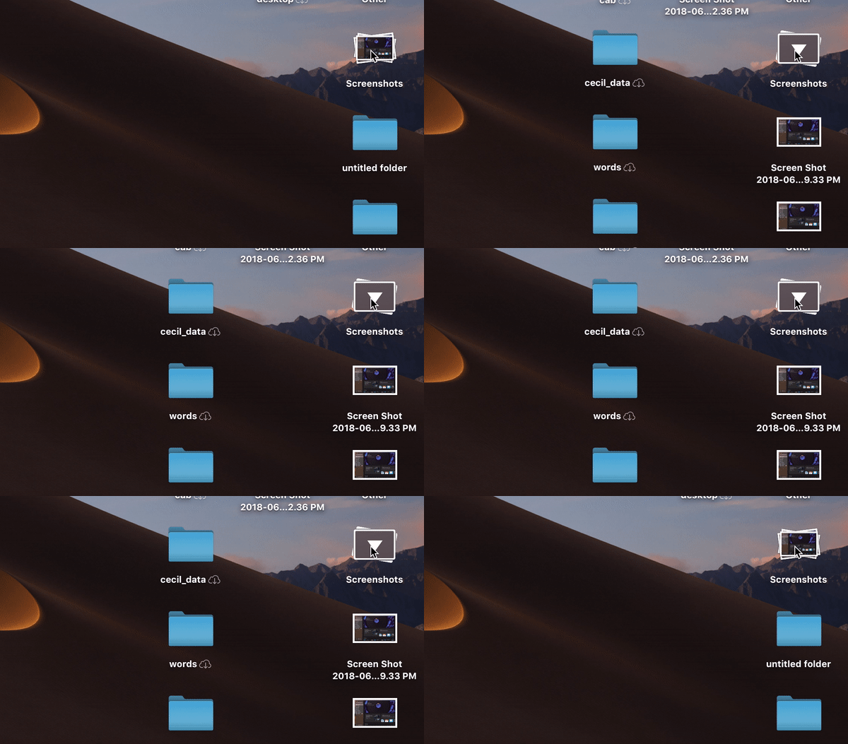
By default, the feature groups files by type. From the drop down, you can toggle this to group things by Date Last Opened, Date Modified, Date Added, Date Created or Tags. Clicking the top of the pile expands them out, so you can view everything at once.
Oh, and if you click Use Stacks again, everything will fly back into place, resorting your unruly desktop in the process.
Dark Mode
When Apple announced Mojave back at WWDC, Dark Mode got far and away the biggest response from the crowd. That’s what you get for putting on a show in a room full of developers. Of course, they’re not the only ones who’ve been champing at the bit for the feature. Videographers, photographers — really anyone who spends a lot of time staring at screens in dark rooms will likely appreciate the option.
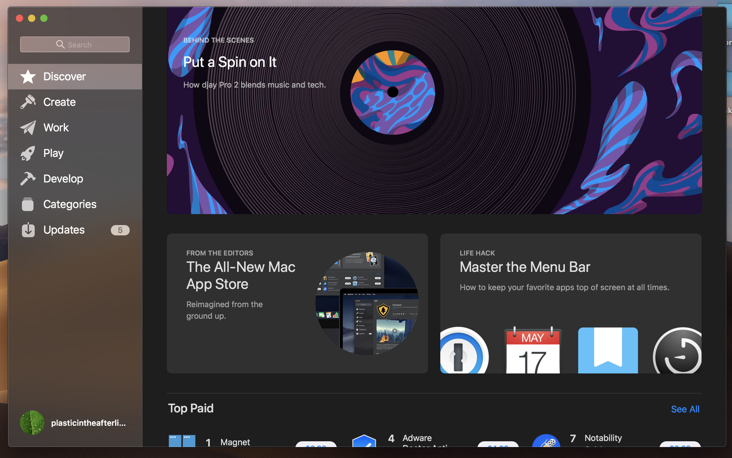
When the feature is enabled, those applications that support it will default to the mode. The borders and backgrounds turn dark and white text is highlighted on a black background. In my Mojave first look a few months back, I lamented the lack of apps supporting the feature. At the time, Dark Mode was largely the realm of Apple’s own apps. Mail, Contacts, Calendar, and Safari Reader are among them.

Understandably so. Lead by example, I guess. Things have improved a bit since then. According to the site Dark Mode List, which aggregates examples from both macOS and iOS, there are at least 78 applications that currently support the feature .
It’s a start, but there’s still a long ways to go. After all, you lose some of the effect when you switch back and forth between apps that do and don’t offer the setting. For example, while Safari supports it, neither Firefox nor Chrome do. Also, some of Apple’s own, not pre-installed applications don’t support it either, including Pages. That said, the list is understandably pretty heavy on developer tools.
With Mojave launching today, however, I’d anticipate that we’re going to see more companies rolling out the option soon. In the meantime, it’s a handy feature for those who need it and it’s a nice option for the rest of us.

Dynamic Desktop is a fun addition — though there are two options at the moment. there’s the standard Mojave sand dune, and Solar Gradient. Both shift during the day, gradually darkening as the sun starts going down. It’s a nice complement to Dark Mode, and a neat spin on the blue light reducing Night Shift feature that’s been around for a while now. Of course, more wallpaper options would be welcome.
Screenshots

Okay, this is one of those ones I know I’m going to get a lot more use out of than most of you normal folks. Day to day, however, I’d say this is the feature I interact with the most. When you take a screenshot, a small thumbnail pops up in the bottom, right hand corner of the screen, similar to what you get on iOS.
It stays for a few seconds and then quickly slides off screen. It’s a quick and handy way to see if you got the job done. You can also click into the thumbnail to open it up to full size and edit it accordingly. Screenshots can now be saved to a number of different destinations to help avoid messing up your desktop, including Preview, Messages, Mail, Documents and Clipboard.
There’s a new control panel accessible by hitting Shift-Command-5. From here, you can capture the entire screen, capture a window, select a portion of the screen, record a video of the full screen or just record a piece of the screen. I used those last bits with a little less regularity, but all of the above really came in handy when putting together the images for this writeup.
Continuity Camera is a new feature worth mentioning in the same breath. It’s yet another avenue where the company is able to flex its cross-device functionality. The somewhat clunkily named feature is built into updates to first-party apps like Pages, Keynote, Numbers, Notes, Mail, Messages and Text Edit.
Once in the program, click Take Photo and it will utilize a connected iPhone or iPad to capture media. Take the shot, click Use Photo and boom, the image is inserted into the application. It’s a clever feature that works like a charm, though I’ll be honest — I haven’t found a ton of applications for it in my own life. The number of times I’ve been writing something on my laptop I felt would be enhanced by taking a shot of something nearby have been fairly limited, thus far.
That said, I could certainly see using it to scan a document into a PDF being a handy one. I probably could/should have used then when applying for a Chinese visa a few months back. With so many of these new features, however, the trick is making a point to make it a part of your workflow.
Finder
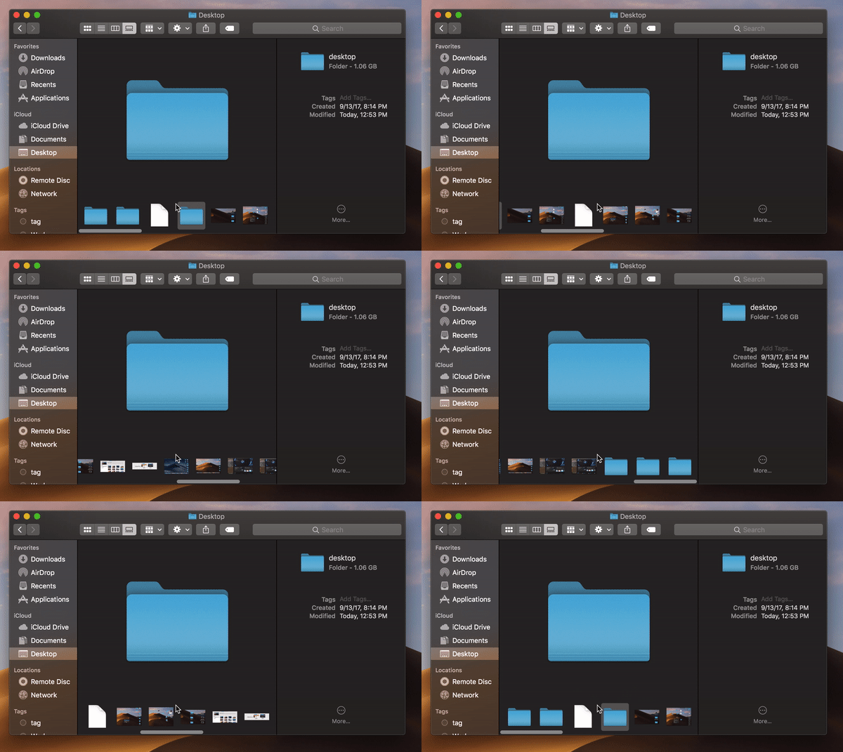
Gallery View is a nice tweak on the old Apple Cover flow feature, offering large thumbnails of files, with smaller, scrollable versions down below. Here, however, you get a full, straight on shot of the image. It’s particularly useful when scrolling through a lot of images quickly.
The addition of full metadata is clearly another bit aimed at appealing to professionals. Click a photo and you get a LOT of information in the side pane — more than most users will likely know what to do with. Along with the standard file size and dimensions, Apple now serves up things like camera model, aperture number and other EXIF data.

Quick Actions, meanwhile, brings some iPhone-style editing tools to the bottom of the side pane. From here, you can rotate an image — which is actually pretty helpful in my line of work — or mark it up in a number ways, including highlighting and the adding in a signature, a la Adobe PDF. Apple’s actually made Preview a bit redundant here, by bringing some of its best features directly to the desktop.
iOS apps on desktop

This is arguably the most interesting addition from an overall strategy perspective. Apple made a point of assuring its audience of developers and users that macOS and iOS are not merging, as has long been rumored. We all breathed a collective sigh of relief, before the company showed off one new way in which the lines are being further blurred.
The company is making it easier to convert mobile apps into a desktop versions. Why? For one thing, Apple would love it if more desktop applications were purchased through the Mac App Store — there are plenty of economic, ecosystem and security reasons for this, most of which should be fairly obvious. It’s also in the company’s best interest to have its most popular developers creating content for all of its platforms.
To kick things off, Apple made three of its own first-party apps available in desktop form: Voice Memos, Stocks, Home and News. Of the three, News is the one that’s made its way into my heavy rotation. It seems a bit silly to have a standalone news app, with all of the access desktop browsers afford. But after installing it and walking through the curation process, I’ve grown to appreciate the desktop notifications for breaking news.
Again, there are a thousand other ways to access that information, but News is a handy one-stop shop. That said, I rarely found myself interacting directly with the app. I mostly clicked through interesting notifications as they popped through. Thankfully, they never came through with too much frequency, which would be absolutely maddening.

Voice Memo is an interesting addition, as well. The cloud sharing with iOS devices is the killer app here. You can record something on your iPhone and listen to and edit it on the desktop. The use for desktop recording is a bit less clear. In most cases, it probably makes more sense to pull out your smartphone to record.
The gesture makes it clear that you’re recording the other person, it’s easier to move to device closer to the source of audio, and you don’t have to deal with the sound of your own typing during the recording process.
The desktop versions of iOS apps are also interesting from a UX perspective. Aside from scaling, not all that much appears to be tweaked — and that’s kind of the point. It’s a heck of a lot easier to essentially port something over than it is to rebuild from the ground up. Of course, without a touchscreen Mac, you’re interfacing with the applications through the cursor. In a few of my less proud moments, if found my hand wanting to reach out to tap the screen.
This is particularly the case with Home. The desktop version of Apple’s smart home app retains the square tiles from its predecessors. Still, the inclusion of the app in this original quartet makes sense from a user stand point. It’s handy, having access to all your connected home info in a single place accessible at work or on the road.
Odds and ends

Okay, time to bust out the bullet points.
- That 32-person FaceTime chat is arriving some time later this fall on macOS. That will be a fun one to test — and I suspect a bit more manageable on a larger screen.
- Both the Mac App Store and iTunes have gotten makeovers. The updates are in keeping with the company’s push toward editorial curation to help drive engagement. Anything that pays more humans to write about things like music is a good thing, in my book.
- Your Mac will now ask for consent when apps access your camera or microphone, similar to what the company does on the iPhone. I people won’t be in a rush to remove the masking tape from their webcams, but this is definitely a good thing.
- Safari’s protections have been beefed up. Passwords are stronger and last year’s cookie-busting Intelligent has been beefed up. Per Apple,
When you browse the web, the characteristics of your device can be used by advertisers to create a “fingerprint” to track you. Safari now thwarts this by only sharing a simplified system profile. And now improved Intelligent Tracking Prevention keeps embedded content such as social media Like buttons, Share buttons, and comment widgets from tracking you without your permission.
Time to upgrade
Is Mojave worth the upgrade? Well, yeah, duh. It’s free and brings a number of interesting new features. I’m not sure I’d call it a “love letter to developers,” to borrow a phrase from our iMac Pro review, but coupled with that new hardware, Apple’s clearly letting creatives know that there’s a place for them in the Mac’s future.
Your mileage will vary, of course, but I’ve found plenty of new features that integrate nicely into my own workflow. Stacks, Dark Mode and improved screenshots have all proven handy in the months I’ve been running the beta on both my work and personal systems. The final version of the operating system drops today for everyone, so you can partake without in all of those with a much more certainty.
0 coment�rios:
Post a Comment