
- Google is bringing the Material Theme to its Calendar app on Android.
- Most of the changes are UI-focused and don’t introduce any new features.
- Version 6.0 is rolling out now and should make its way to your devices very soon.
Last week, Google started pushing out its Material Theme to the company’s Calculator app. Now, the search giant is making the refreshed design available in version 6.0 of the Google Calendar app for Android.
Unlike some of the other Google services that received this redesign, it doesn’t appear as though the search giant is changing much about the app other than its UI. As you can see from the two sets of screenshots below, the majority of the changes come in the form of new icons, the use of the company’s new Product Sans font, and a lot more white space.
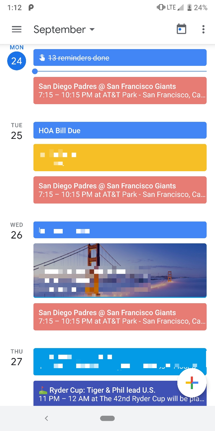
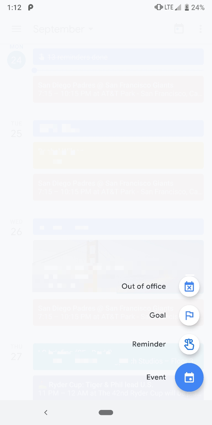
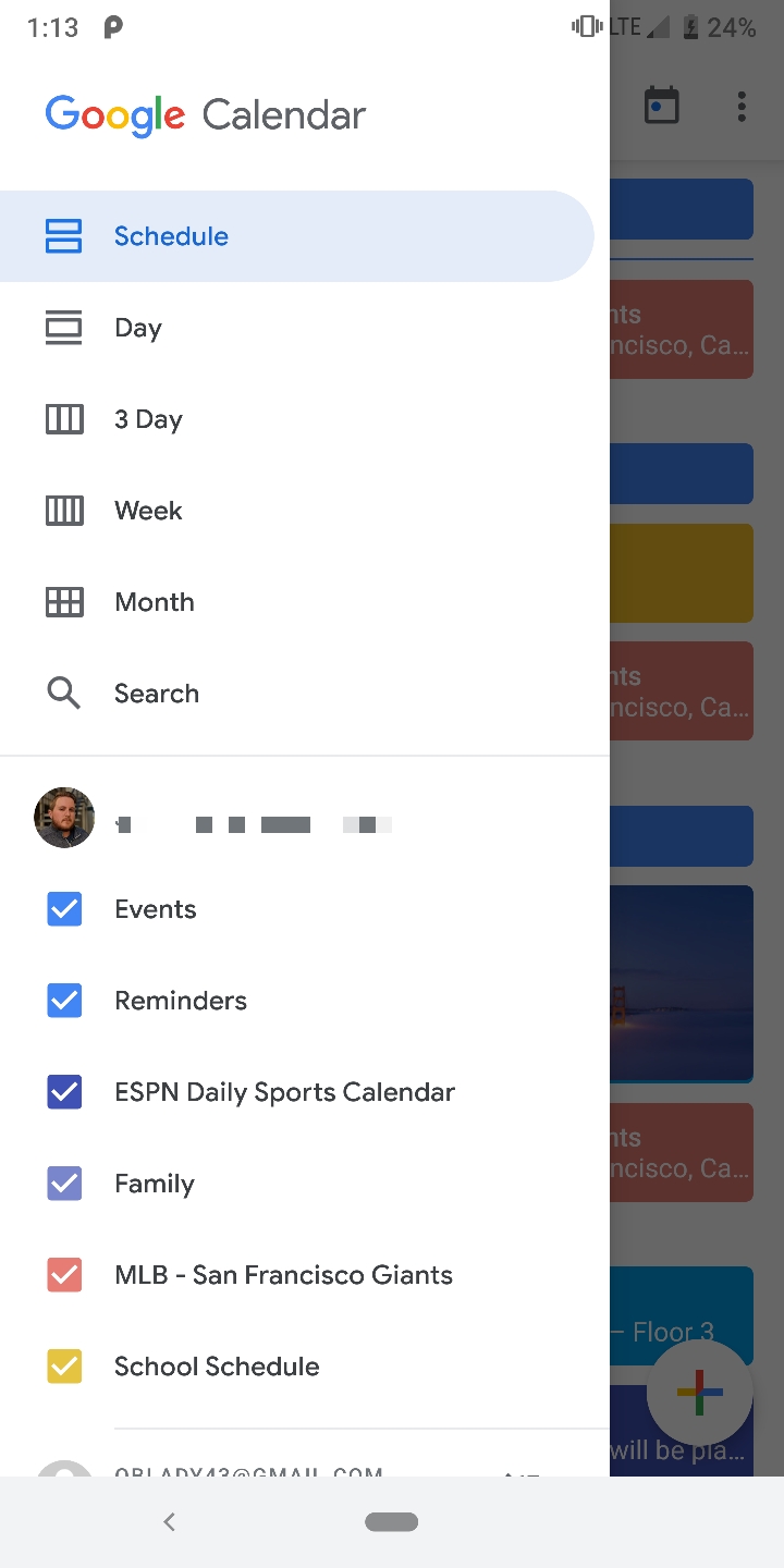
New design
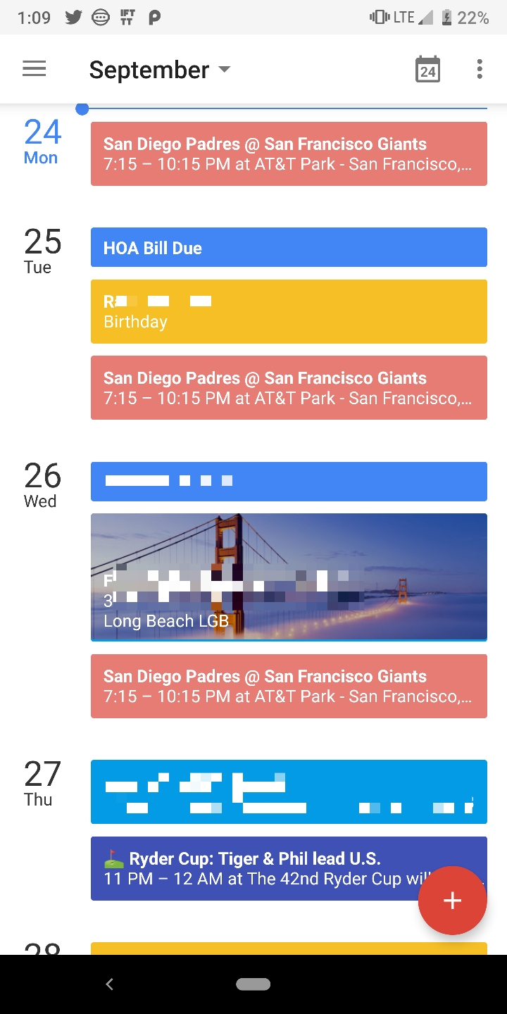
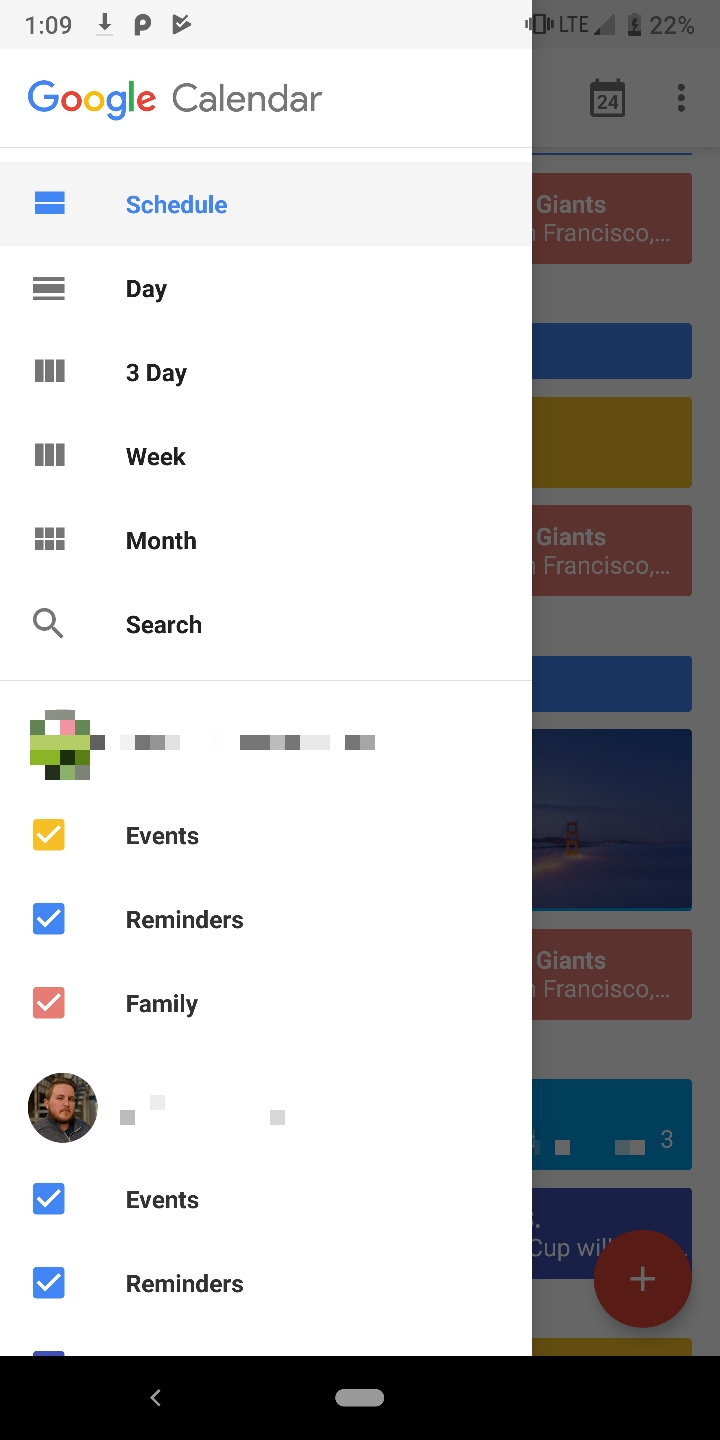
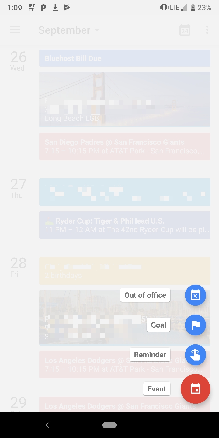
Old design
While the Material Theme now makes the Android version of the Calendar app more in line with its online counterpart, there is one element that stands out: the new floating action button. Unlike the old red icon, the new button is primarily white with a multi-colored plus symbol in the center.
The update is rolling out right now so click on the button below to see if it’s available for your device. If it isn’t, wait a couple of days, and then the update should be live for everyone.
0 coment�rios:
Post a Comment