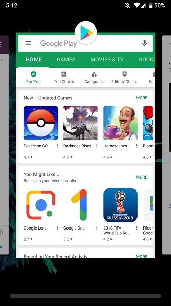
The Android P beta 3 landed yesterday and we’ve been digging into what’s new in the latest build. It’s a comparatively lightweight update without any major feature additions, but there are some small design tweaks you might notice if you get your hands on it. Here are a few we’ve found so far.
Improved gesture navigation
Google introduced gesture navigation in an earlier Android P release but it’s at its best with the latest version. This lets you scroll through items in the multitasking menu and it originally appeared only across the bottom right half of the screen, as you can see in the image below.

This has been changed in beta 3 to become a full-width sliding bar, letting users more easily scroll left and right through the item list. What’s more, the scroll function now selects the app you land on (it pops it open into the full-screen view) so you don’t have to select it manually.
Quick settings icons
You’ve also got new quick settings icons in Android P beta 3, though they’re of the “blink and you’ll miss them” variety. Some of the icons that previously had a bold fill (like the flashlight and battery) are now just outlines. You’ll see this change reflected in the system icons too.
Auto Rotate icon
Android P has moved the auto-rotate button, previously found on the bottom edge of the navigation bar (seen below) so that it replaces the “recents” button when using gesture navigation.
It’s another minor change but it means the feature becomes more purposeful and is no longer tacked-on in an inconvenient area.
Return key
Finally, Google has altered the “return” key, or back button, so that it’s now an arrow rather than a triangle. The button still functions the same as it always did, the move merely underscores Google’s renewed focus on simplicity in Android P (why do with three lines what you could do with two?).
We’ve also written about the Android P beta 3’s manual switch for light and dark themes a recent article — check that out at the link.
Have you noticed any other changes in the Android P beta 3? Let us know what they are in the comments.


0 coment�rios:
Post a Comment